Wyngman Agency
With the rapid evolution of AI approaching the horizon, we will experience an increasing influence of this technology in many aspects of our lives. A big part of that change is coming to our workplaces. AI will take over jobs, but jobs around the field of AI will also emerge.
Wyngman Agency aimed to utilize AI to replace salespeople needed for email marketing and turn bland copy-paste-like cold emails into personalized and tailored emails that prospects will open and engage with on a wide scale, helping businesses find new clients and build strong B2B partnerships.
Services
Logo Design, Visual Identity Design
Year
2023


The idea
When my brother David approached me to come up with a fitting visual identity for his new project Wyngman Agency I was thrilled and more than happy to help him out. It’s always a pleasure when friends and family approach me for some design work – helping out the people you love with a skill that you have is super fulfilling. As with all projects, I started by collecting important information through my brief questionnaire and the references from the provided mood board.
The brief provided me with some key information nuggets that helped me tremendously in the process of coming up with the symbol you see on top. Words that stuck out were: wing, monogram, simple, and minimalistic. With this information at hand, I could already see this symbol forming in my mind’s eye. I explored other ideas as well to make sure I didn’t miss out on other potentially good ideas, but I came back to this idea quite quickly. Sometimes you don’t have to dig for long until you strike gold.
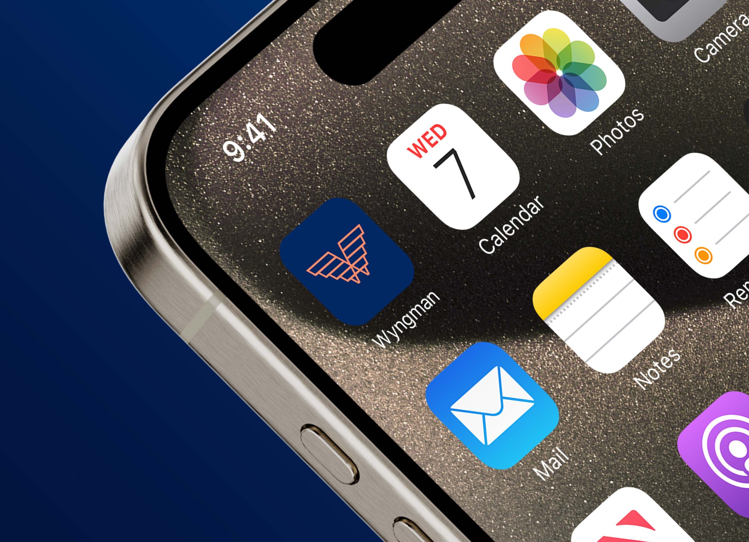
The symbol features the initials of the business “W” and “A” which I combined into the shape of wings to represent not only the company name, but it was also important to my brother, that the symbol emanates a sense of trust, professionalism, and sophistication so it fits his premium pricing of the service he provides.


Colors & Type
Once I was done with the logomark, I ventured out into my collection of fonts to find a fitting pair of typefaces that I could use to combine them with the symbol. I went for some Google Fonts to make sure, my brother could easily use them too. I went for Be Vietnam Pro and Mona Sans. I then increased the tracking in the word “Wyngman” to combine the premium and high class appeal of the symbol with the typeface. Lot’s of luxury brands use this in their logotype to fascilitate a sense of luxury and high quality.
Once I was done with the symbol and choice of typefaces, I threw some color into the mix to finish off this design stage. For the colors I went for a royal dark blue, paired with a brighter coral red. The darker blue evokes a sense of trust and high class, while the coral red brings in a sense of excitement and energy, referencing the thrill and change coming through AI development. Having looked at different competitors, I wanted to ensure that my brother has some colors at hand that differentiate him from others in his market which made me go for this color palette.


Testimonial
Here are some words from my brother, the main founder of Wyngman Agency:
We worked with Phillip to revamp our complete brand identity… colors, branding, and structure. We only had a rough idea of the style we liked. What I do appreciate is, that Phillip somehow was able to translate our rather sparse instructions into 3 well-crafted logos and designs. We quickly agreed on one to proceed and within another week we got the final result in our hands. I recommend his design skills to everyone who wants their brand to become a serious player in their market and be remembered by their prospects.