Spilt Milk
Spilt Milk is an advice podcast that encourages open conversations about struggles and worries that people face in their lives. They made it their mission to help those who don’t have a strong support system in their lives.
Every week they open their doors to the public and allow listeners to anonymously call in and share their problems.
They needed to do a rebrand as currently, their podcast isn’t reaching the right people and they think this is due to their DIY branding.
Services
Logo Design, social Media Templates,
branded merch
Year
2023


The idea
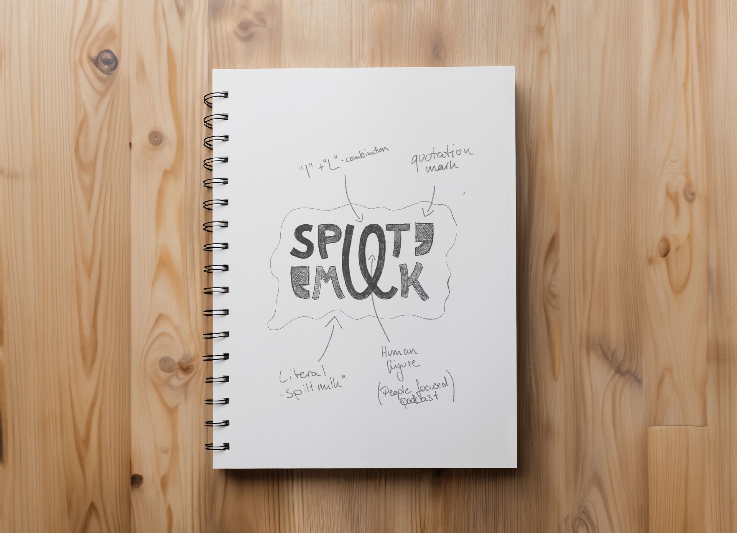
As you can see on the sketch compared to the final design, I started off with roughly the same idea, but I got rid of a few elements as I found them unnecessary to convey what the podcast is about. I always strive to be detailed, without being detailed and to distill the essence of a design down to its core elements that convey the message without unnecessary fluff.
I created a custom-type solution that contains a letter that can be used as a separate design element, a logomark so to speak. Since the podcast is about people, I wanted the letters to look hand-written to emphasize on this aspect. I gave the letters a quirky feel to make the design more fun and upbeat. Since the podcast is about struggles and problems people face, I wanted the design to emphasize how they might feel after calling in or listening to the podcast: hopeful, more alive, joyful. The design is meant to convey that.
The “IL” in SPILT MILK was the perfect opportunity to combine them into the logomark since these letters are contained in both letters and I was able to emphasize the human-centered theme of the podcast even further by creating a stick figure by combining the I and the L – making that figure reach out also hints to people that they can call in on the podcast.


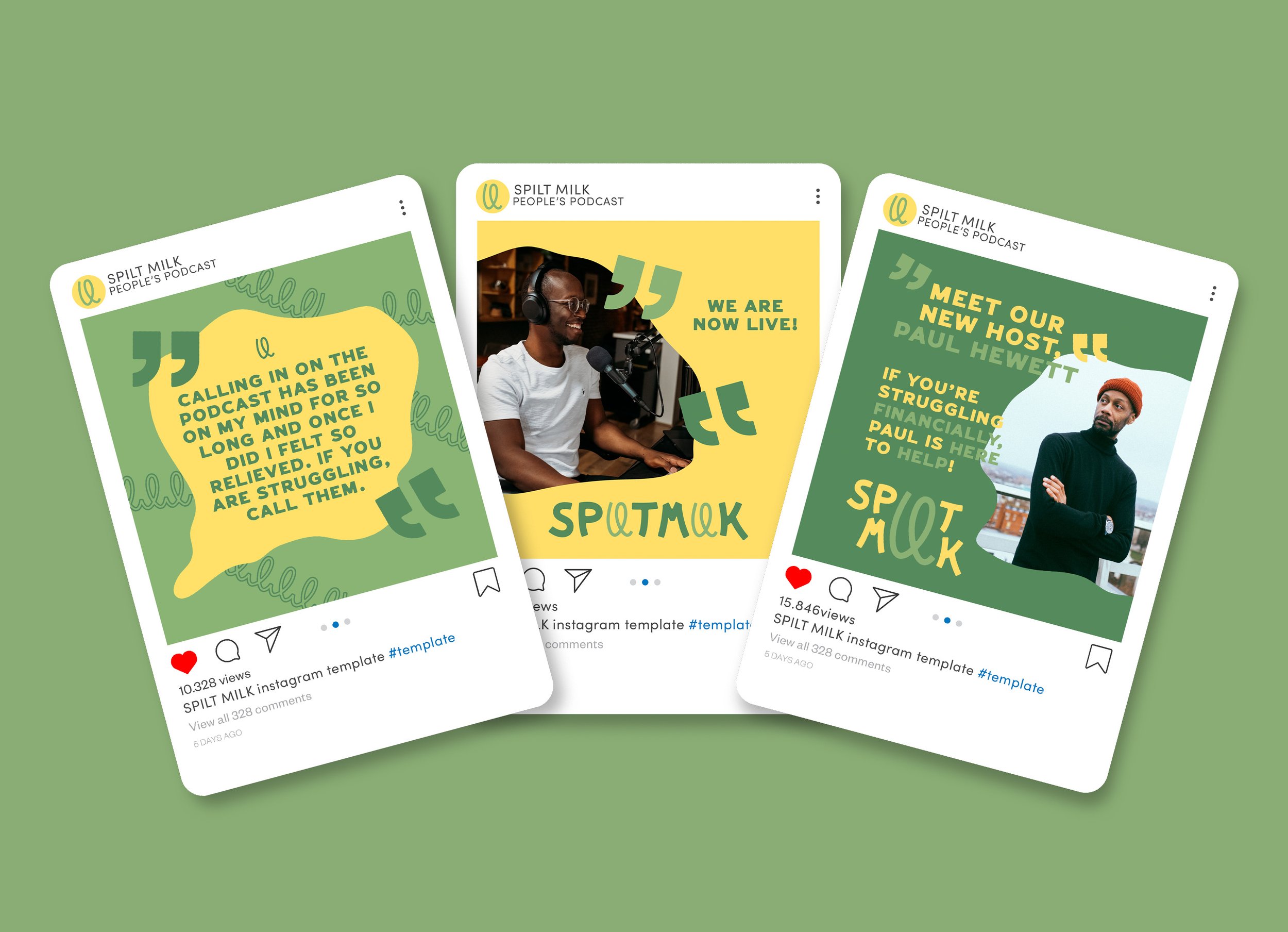
Colors & Type
The type is completely custom-made and offers a unique look for the visual identity of the podcast. The quirky look of the letters infused with a vibrant color palette makes the design energetic, approachable, and inviting – helping the podcast reach its targeted audience.
For the colors, I went for a combination of yellow and two tones of green to underline the emotions the design is supposed to evoke in people who come into contact with it: energetic, hopeful, and a sense of aliveness. Talking with someone about a problem we face can be such an uplifting experience – this sense of feeling “lighter” is captured in the colors and the design itself. Fusing these two things together cements this statement into a visual identity that speaks for itself.


This is a portfolio project and the brief was provided by Abi Connick on her Instagram page where she hosts the creative glow challenge. If you’re interested in buying this concept, feel free to contact me.