Sketchy Beans
Sketchy Beans is a creative sanctuary for creative professionals who look for a place that combines the best of both worlds: kickass coffee and a quiet place to get into the zone and create their very best work. With no children allowed and minimal noise, this place is a godsend for creatives who need a change of scenery next to their own offices, but still want to have the ability to work just as focused.
Comfortable chairs, standing desks, graphic tablets, light boxes, free WIFI – you name it, Sketchy Beans has it. This is a place for deep work and focused creativity.
Services
Logo design, visual identity design
Year
2023


The idea
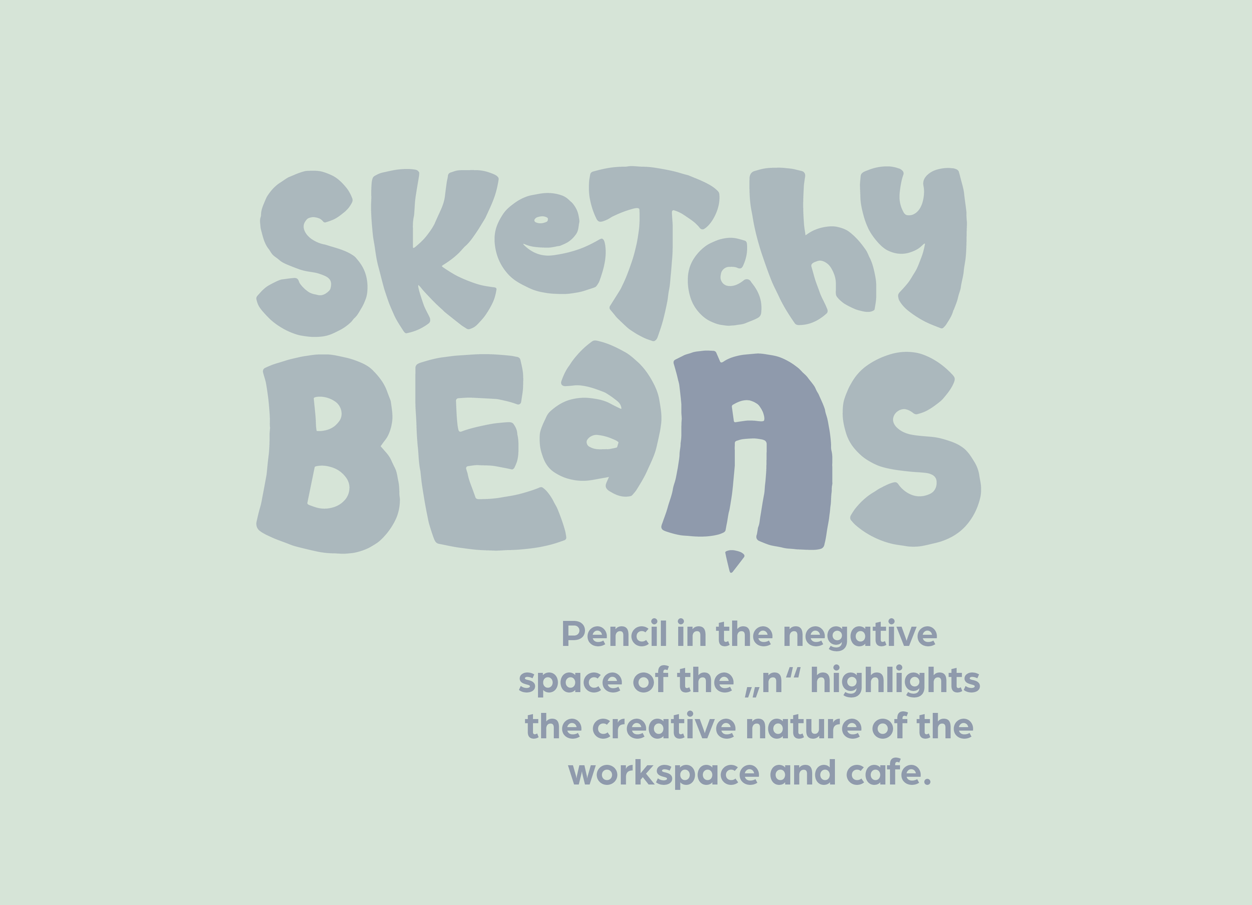
The brief from James Martin, a.k.a Made By James, he would like the logo to have an element that can be used as a symbol if I chose to go with a logotype for this project. Since I looked for a challenge to practice my skills for custom typography, I was up to the challenge and found my way around some cool design direction that I pursued until I was satisfied. The goal was to come up with a design that has something raw to it, no random font plucked from the internet, but some real illustrative and “sketchy” character. And since the business is described as welcoming, energetic, fun and a good deal of creative energy, I created letterforms that jump around to emphasize the energetic part and highlighted on of the letters by turning it into a symbol that can be used seperately form the logotype.
The white space of the N in Beans has the shape of a pencil to highlight the creativity aspect of the business and it fulfills the role of ensuring that the brand can apply the design to all types of situations. The n could be used as a social media avatar for example.


Colors
In the briefing, James didn’t mention any specific colors he would like to see but highlighted his preference for a muted color palette that aids the place in creating a focused atmosphere away from bright and saturated colors. I took this information to heart and went for a combination of a desaturated blue/grey with a pastel green tone as the background color. This combination is still very pleasant to look at, but doesn’t take away the attention, screaming “LOOK AT ME I AM A BIRGHT COLOR!!”.


This design is a portfolio project. The brief was provided by the legend James Martin himself at the end of his Logo Legend Course that gave me the opportunity to practice all the skills I learned throughout the course.