Wer Weiß Wohin
Wer Weiß Wohin is a project by my uncle who owns a business specializing in CAD prototyping and 3D printing for carparts, cruiseships, trains – basically any part of a car or other piece of marvellous engineering can be created by him.
Next to his company, he also wanted to start something for himself where he can use is machines and his skill to built custom-made trailers that can be mounted on pick-up trucks like a Dodge Ram for example.
He tasked me with creating a logo for this project as he plans to realize this concept within the next year or two.
Services
Logo Design
Year
2023


The idea


When my uncle approached me to help him out with his business idea by creating a logo for him, I was thrilled and ready to go! And as with all clients I took him through my structured creative process and came up with this winner!
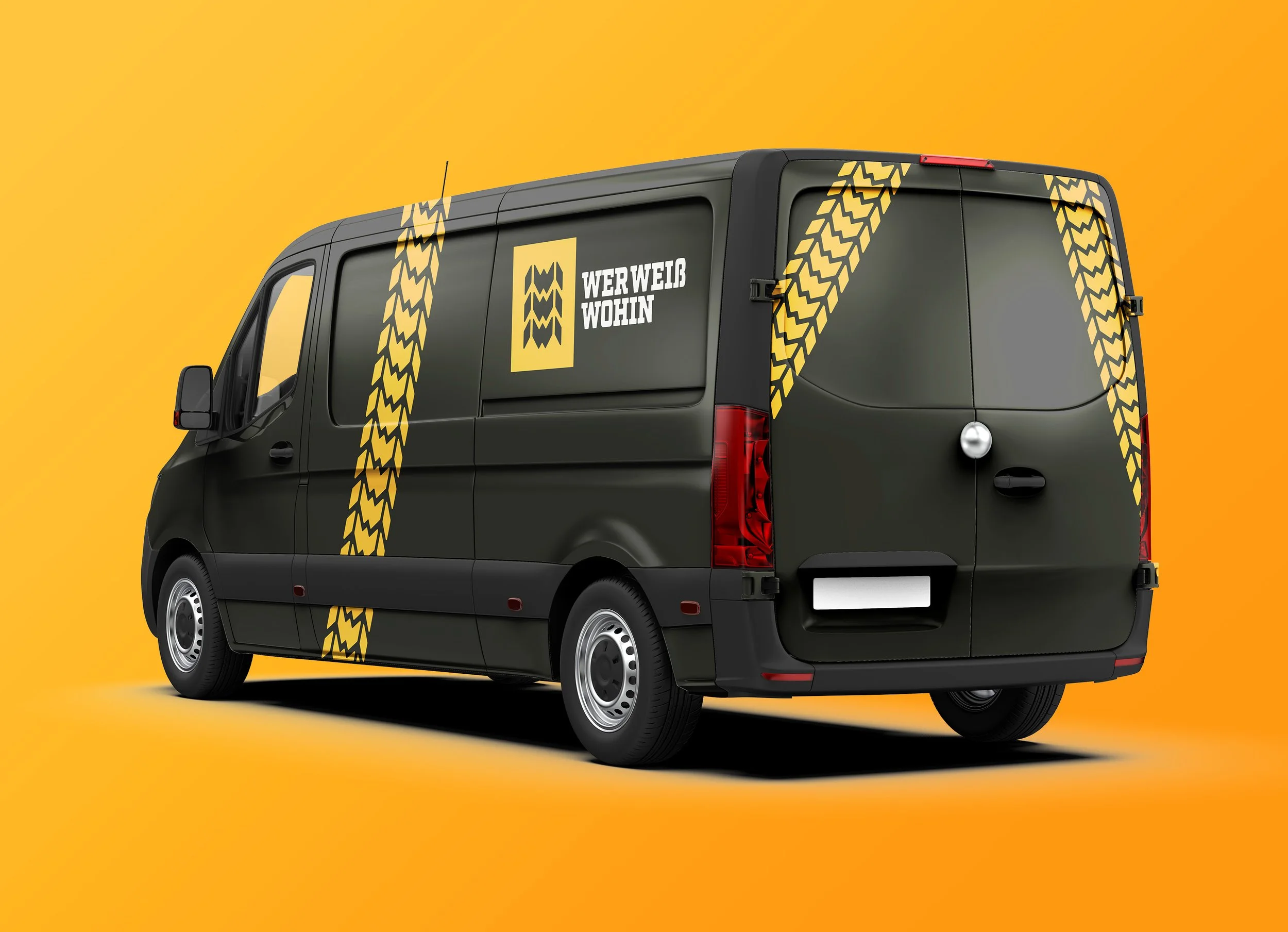
The name of his new business project is “Wer Weiß Wohin” – that’s German and means something along the lines of “Who knows where to go next?!”. It is meant to evoke a sense of adventure and the thrill of the unknown. During my sketching phase, I played around with the concept of a tire, since this was a project closely related to cars and the adventure of traveling. But it was too obvious and bland to pursue further. Then I started playing around with the shape of the three W’s and came across the concept circled in the above image.
I love that feeling when a concept comes together and you get all tingly and excited, knowing you’ve just hit gold! And I did because as I took this concept to the final stages of the design process, it all came together perfectly. The outcome is a brand mark that is my all-time favorite I have ever created. It’s simple, captures the essence of the business, and comes with a neat design that can be applied to any area or use case. It’s simple to remember and still incredibly powerful.

Colors & Type

The briefing provided me with the information, that my uncle would like to have a lively color combination that is highly contrasting and energetic and he would prefer a color ranging from yellow to red. I found yellow too upbeat and red too aggressive so I opted out for the middle way and used an orange that I combined with black as the secondary color. This way the energy of the orange can be used very effectively when contrasted with the black.
For the logotype, I used Roboto Slab as the foundation and customized the letters a little to create more harmony between symbol and type. I rounded off the corners of the letters to the same amount as the corners in the symbol and redrew the “ß” in a more “blocky” version to better account for the overall industrial vibe I was going for.